GOAL
Fragmented experience and visual inconsistencies undermining user engagement.
Our main goal was to reinvent Sevilla FC's digital positioning and visual representation through three main digital products: the website, the mobile app, and the TV apps. We placed the fan at the center of the project. Navigation: Intuitive and clear navigation of information, allowing users to effortlessly discover and interact with essential features. Create navigation that is scalable across other digital products such as mobile apps and T
Navigation: Intuitive and clear navigation of information, allowing users to effortlessly discover and interact with essential features. Create navigation that is scalable across other digital products such as mobile apps and TV
Purchase flow: improve the purchasing flow of all those elements that enable the club to generate economic value and allow users to purchase tickets, experiences, and tours at the stadium.
Fan engagement: Sevilla's ecosystem wasn't just about being an information hub and a place to buy tickets; it was also important to provide fans with exclusive content through videos, podcasts, live radio, and much more.
Improve visual look: We modernized the interface to better align with contemporary design standards, making the site more visually engaging and easier to use. The visual approach was guided by a minimal, ultra-clean aesthetic, which was a key preference of the client.
SOLUTION
Create a unified digital ecosystem for the club.
The overarching goal of the Sevilla FC project was to design and deliver a unified digital ecosystem that brings together the club’s official website, mobile application, and TV app into a single, coherent Digital Experience Platform. Instead of treating each touchpoint as a standalone product, the project aimed to consolidate all content, services, and fan interactions into one centralized, scalable system that could support live and on-demand content, fan engagement, ticketing, merchandising, and more across devices.
Creting a first impression with impact, starting from a new navigation experience.
The site’s information architecture was thoroughly analyzed to understand which sections were most visited and most valuable for users. Based on this data-driven assessment, a new information hierarchy was established to prioritize both user needs and business goals.
The redesigned primary navigation highlights the most relevant areas for users and the club’s monetization strategies, including ticket purchases and participation in events and experiences organized by the club.
In addition, the side menu implements a two-tier navigation structure that houses all secondary informative sections, such as team pages, news, and the club’s history. This approach ensures a clearer, more intuitive, and more accessible navigation experience for fans.
Improving discoverability and conversions
One of the main issues we identified was users’ difficulty in understanding and completing the purchase flow for tickets, experiences, merchandise, and tours/events. This journey was neither clear nor immediately accessible, leading to confusion and hindering conversions. To improve this aspect, in addition to making the navigation more intuitive and focused on purchase actions, we added direct access widgets on the homepage designed to simplify interaction with the club’s primary commercial offerings. These include a widget for purchasing individual match tickets, a widget dedicated to official jerseys with a direct link to the shop, and a widget that keeps the season ticket campaign always visible.
Elevating fan engagement through video integration
Unlike the previous institutional site where videos were hosted separately on external platforms, the new digital ecosystem integrates audiovisual content directly into the user experience across web, mobile app and tv app. We introduced a dedicated section that brings together live and on-demand videos, exclusive content, radio, and 24/7 channels, making video consumption a central element of fan engagement. This shift not only enhances accessibility and immersion for users, but also strengthens the club’s ability to connect with its global fanbase through rich, engaging multimedia content. As a result, the platform has quickly become a core part of Sevilla FC’s digital strategy, showcasing original productions and live matches in a unified, data-driven experience

Modular and scalable design system
For the Sevilla FC web project, a system of modular and reusable widgets was developed, designed to provide flexibility and customization in different sections of the site. This architecture allows the client to easily add new pages or sections in the future while maintaining consistency and ease of management.
Each widget is designed as an independent component, allowing complex layouts to be assembled without compromising visual or functional consistency. Widgets can be adapted to different needs, whether for editorial content or interactive functionality, ensuring an optimal user experience. The modular structure facilitates the use of widgets on different pages or sections, reducing development time and maintaining a consistent interface.
In summary the design system has lead to
ensured visual and functional consistency
reduced development rework
enabled faster future iterations


We relaunched Sevilla FC by transforming the old digital ecosystem into a vibrant new experience.
Year:
2025 - 4 months
Core responsabilities:
Research, Visual design, App's Design system
Output:
Website, Mobile Apps, TV Apps
Credits:
HiWay Media

MY ROLE
I was responsible for conducting the initial discovery and visual research for the project, laying the foundation for both strategy and aesthetics.
As a Senior UX/UI Designer, I acted as the UX reference point within the team, collaborating closely with product managers, developers and the client. Following this, I played an integral role in the composition of the design system for both mobile and TV applications, shaping its structure, components, and visual language. I was responsible of designing user flows, creating wireframes, designing design system, UI design for mobile app and producing all the documentation for developers.
LEARNINGS
Key takeaways for the project
This project reinforced my approach to designing in real-world conditions
Strong systems compensate for limited research
Clarity is crucial in multi-device experiences
Design systems are strategic tools, not just visual assets
PROBLEM STATEMENT
Fragmented experience and visual inconsistencies undermining user engagement.
Although the site contained rich details about the club’s history, activities, and events, with exclusive content and dedicated sections for the most engaged fans, it lacked a cohesive and interconnected structure between these areas. This caused users to lose direction in their journey, resulting in a high abandonment rate and a missed opportunity to fully showcase the club’s activities and events that could drive revenue growth.
At the same time, despite an existing brand identity that was well-defined and applied across other digital channels, the site, apps, and TV experience did not consistently reflect appropriate typographic and color hierarchies. The small font sizes and inconsistent visual treatment made content difficult to read and weakened the overall experience.
Sevilla needed a digital ecosystem that would match the visual standard of leading European clubs and clearly communicate the value it offers, providing users with an intuitive, engaging, and unified experience.
Next Works


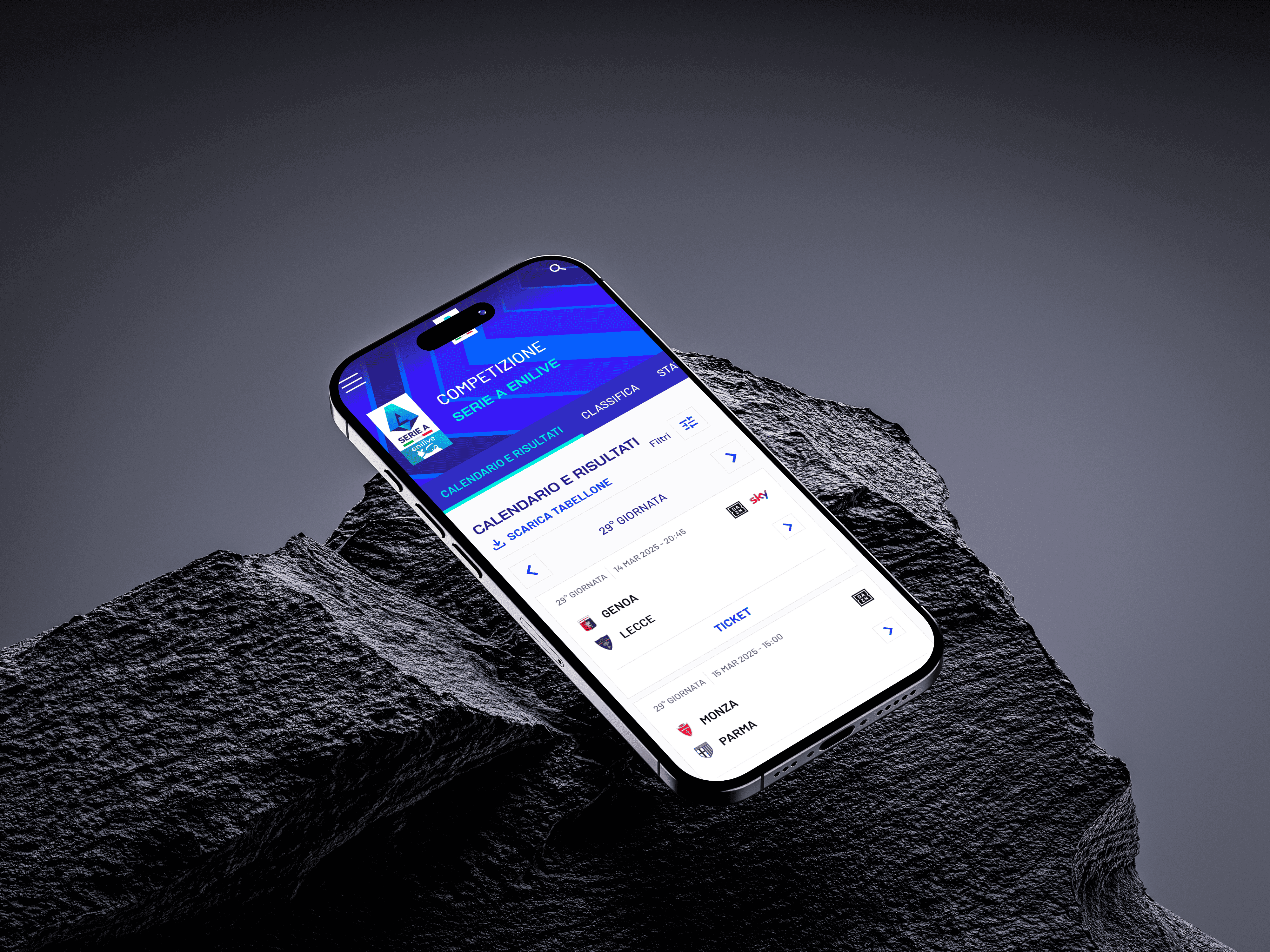
We relaunched Sevilla FC by transforming the old digital ecosystem into a vibrant new experience.
Core responsabilities:
2025 - 4 months
Core responsabilities:
Research, Visual design, App's Design system
Output:
Website, Mobile Apps, TV Apps
Credits:
HiWay Media
MY ROLE
I was responsible for conducting the initial discovery and visual research for the project, laying the foundation for both strategy and aesthetics.
As a Senior UX/UI Designer, I acted as the UX reference point within the team, collaborating closely with product managers, developers and the client. Following this, I played an integral role in the composition of the design system for both mobile and TV applications, shaping its structure, components, and visual language. I was responsible of designing user flows, creating wireframes, designing design system, UI design for mobile app and producing all the documentation for developers.
PROBLEM STATEMENT
Fragmented experience and visual inconsistencies undermining user engagement.
Although the site contained rich details about the club’s history, activities, and events, with exclusive content and dedicated sections for the most engaged fans, it lacked a cohesive and interconnected structure between these areas. This caused users to lose direction in their journey, resulting in a high abandonment rate and a missed opportunity to fully showcase the club’s activities and events that could drive revenue growth.
At the same time, despite an existing brand identity that was well-defined and applied across other digital channels, the site, apps, and TV experience did not consistently reflect appropriate typographic and color hierarchies. The small font sizes and inconsistent visual treatment made content difficult to read and weakened the overall experience.
Sevilla needed a digital ecosystem that would match the visual standard of leading European clubs and clearly communicate the value it offers, providing users with an intuitive, engaging, and unified experience.
GOAL
Fragmented experience and visual inconsistencies undermining user engagement.
Our main goal was to reinvent Sevilla FC's digital positioning and visual representation through three main digital products: the website, the mobile app, and the TV apps. We placed the fan at the center of the project. Navigation: Intuitive and clear navigation of information, allowing users to effortlessly discover and interact with essential features. Create navigation that is scalable across other digital products such as mobile apps and TV
Navigation: Intuitive and clear navigation of information, allowing users to effortlessly discover and interact with essential features. Create navigation that is scalable across other digital products such as mobile apps and TV
Purchase flow: improve the purchasing flow of all those elements that enable the club to generate economic value and allow users to purchase tickets, experiences, and tours at the stadium.
Fan engagement: Sevilla's ecosystem wasn't just about being an information hub and a place to buy tickets; it was also important to provide fans with exclusive content through videos, podcasts, live radio, and much more.
Improve visual look: We modernized the interface to better align with contemporary design standards, making the site more visually engaging and easier to use. The visual approach was guided by a minimal, ultra-clean aesthetic, which was a key preference of the client.
SOLUTION
Create a unified digital ecosystem for the club.
The overarching goal of the Sevilla FC project was to design and deliver a unified digital ecosystem that brings together the club’s official website, mobile application, and TV app into a single, coherent Digital Experience Platform. Instead of treating each touchpoint as a standalone product, the project aimed to consolidate all content, services, and fan interactions into one centralized, scalable system that could support live and on-demand content, fan engagement, ticketing, merchandising, and more across devices.
Creting a first impression with impact, starting from a new navigation experience.
The site’s information architecture was thoroughly analyzed to understand which sections were most visited and most valuable for users. Based on this data-driven assessment, a new information hierarchy was established to prioritize both user needs and business goals.
The redesigned primary navigation highlights the most relevant areas for users and the club’s monetization strategies, including ticket purchases and participation in events and experiences organized by the club.
In addition, the side menu implements a two-tier navigation structure that houses all secondary informative sections, such as team pages, news, and the club’s history. This approach ensures a clearer, more intuitive, and more accessible navigation experience for fans.
Improving discoverability and conversions
One of the main issues we identified was users’ difficulty in understanding and completing the purchase flow for tickets, experiences, merchandise, and tours/events. This journey was neither clear nor immediately accessible, leading to confusion and hindering conversions. To improve this aspect, in addition to making the navigation more intuitive and focused on purchase actions, we added direct access widgets on the homepage designed to simplify interaction with the club’s primary commercial offerings. These include a widget for purchasing individual match tickets, a widget dedicated to official jerseys with a direct link to the shop, and a widget that keeps the season ticket campaign always visible.
Elevating fan engagement through video integration
Unlike the previous institutional site where videos were hosted separately on external platforms, the new digital ecosystem integrates audiovisual content directly into the user experience across web, mobile app and tv app. We introduced a dedicated section that brings together live and on-demand videos, exclusive content, radio, and 24/7 channels, making video consumption a central element of fan engagement. This shift not only enhances accessibility and immersion for users, but also strengthens the club’s ability to connect with its global fanbase through rich, engaging multimedia content. As a result, the platform has quickly become a core part of Sevilla FC’s digital strategy, showcasing original productions and live matches in a unified, data-driven experience
Modular and scalable design system
For the Sevilla FC web project, a system of modular and reusable widgets was developed, designed to provide flexibility and customization in different sections of the site. This architecture allows the client to easily add new pages or sections in the future while maintaining consistency and ease of management.
Each widget is designed as an independent component, allowing complex layouts to be assembled without compromising visual or functional consistency. Widgets can be adapted to different needs, whether for editorial content or interactive functionality, ensuring an optimal user experience. The modular structure facilitates the use of widgets on different pages or sections, reducing development time and maintaining a consistent interface.
In summary the design system has lead to
ensured visual and functional consistency
reduced development rework
enabled faster future iterations
LEARNINGS
Key takeaways for the project
This project reinforced my approach to designing in real-world conditions
Strong systems compensate for limited research
Clarity is crucial in multi-device experiences
Design systems are strategic tools, not just visual assets
Next Works
We relaunched Sevilla FC by transforming the old digital ecosystem into a vibrant new experience.
Year:
2025 - 4 months
Core responsabilities:
Research, Visual design, App's Design system
Output:
Website, Mobile Apps, TV Apps
Credits:
HiWay Media
MY ROLE
I was responsible for conducting the initial discovery and visual research for the project, laying the foundation for both strategy and aesthetics.
As a Senior UX/UI Designer, I acted as the UX reference point within the team, collaborating closely with product managers, developers and the client. Following this, I played an integral role in the composition of the design system for both mobile and TV applications, shaping its structure, components, and visual language. I was responsible of designing user flows, creating wireframes, designing design system, UI design for mobile app and producing all the documentation for developers.
PROBLEM STATEMENT
Fragmented experience and visual inconsistencies undermining user engagement.
Although the site contained rich details about the club’s history, activities, and events, with exclusive content and dedicated sections for the most engaged fans, it lacked a cohesive and interconnected structure between these areas. This caused users to lose direction in their journey, resulting in a high abandonment rate and a missed opportunity to fully showcase the club’s activities and events that could drive revenue growth.
At the same time, despite an existing brand identity that was well-defined and applied across other digital channels, the site, apps, and TV experience did not consistently reflect appropriate typographic and color hierarchies. The small font sizes and inconsistent visual treatment made content difficult to read and weakened the overall experience.
Sevilla needed a digital ecosystem that would match the visual standard of leading European clubs and clearly communicate the value it offers, providing users with an intuitive, engaging, and unified experience.
Improving discoverability and conversions
One of the main issues we identified was users’ difficulty in understanding and completing the purchase flow for tickets, experiences, merchandise, and tours/events. This journey was neither clear nor immediately accessible, leading to confusion and hindering conversions. To improve this aspect, in addition to making the navigation more intuitive and focused on purchase actions, we added direct access widgets on the homepage designed to simplify interaction with the club’s primary commercial offerings. These include a widget for purchasing individual match tickets, a widget dedicated to official jerseys with a direct link to the shop, and a widget that keeps the season ticket campaign always visible.
Elevating fan engagement through video integration
Unlike the previous institutional site where videos were hosted separately on external platforms, the new digital ecosystem integrates audiovisual content directly into the user experience across web, mobile app and tv app. We introduced a dedicated section that brings together live and on-demand videos, exclusive content, radio, and 24/7 channels, making video consumption a central element of fan engagement. This shift not only enhances accessibility and immersion for users, but also strengthens the club’s ability to connect with its global fanbase through rich, engaging multimedia content. As a result, the platform has quickly become a core part of Sevilla FC’s digital strategy, showcasing original productions and live matches in a unified, data-driven experience
GOAL
Fragmented experience and visual inconsistencies undermining user engagement.
Our main goal was to reinvent Sevilla FC's digital positioning and visual representation through three main digital products: the website, the mobile app, and the TV apps. We placed the fan at the center of the project. Navigation: Intuitive and clear navigation of information, allowing users to effortlessly discover and interact with essential features. Create navigation that is scalable across other digital products such as mobile apps and TV
Navigation: Intuitive and clear navigation of information, allowing users to effortlessly discover and interact with essential features. Create navigation that is scalable across other digital products such as mobile apps and TV
Purchase flow: improve the purchasing flow of all those elements that enable the club to generate economic value and allow users to purchase tickets, experiences, and tours at the stadium.
Fan engagement: Sevilla's ecosystem wasn't just about being an information hub and a place to buy tickets; it was also important to provide fans with exclusive content through videos, podcasts, live radio, and much more.
Improve visual look: We modernized the interface to better align with contemporary design standards, making the site more visually engaging and easier to use. The visual approach was guided by a minimal, ultra-clean aesthetic, which was a key preference of the client.
SOLUTION
Create a unified digital ecosystem for the club.
The overarching goal of the Sevilla FC project was to design and deliver a unified digital ecosystem that brings together the club’s official website, mobile application, and TV app into a single, coherent Digital Experience Platform. Instead of treating each touchpoint as a standalone product, the project aimed to consolidate all content, services, and fan interactions into one centralized, scalable system that could support live and on-demand content, fan engagement, ticketing, merchandising, and more across devices.
LEARNINGS
Key takeaways for the project
This project reinforced my approach to designing in real-world conditions
Strong systems compensate for limited research
Clarity is crucial in multi-device experiences
Design systems are strategic tools, not just visual assets
Creting a first impression with impact, starting from a new navigation experience.
The site’s information architecture was thoroughly analyzed to understand which sections were most visited and most valuable for users. Based on this data-driven assessment, a new information hierarchy was established to prioritize both user needs and business goals.
The redesigned primary navigation highlights the most relevant areas for users and the club’s monetization strategies, including ticket purchases and participation in events and experiences organized by the club.
In addition, the side menu implements a two-tier navigation structure that houses all secondary informative sections, such as team pages, news, and the club’s history. This approach ensures a clearer, more intuitive, and more accessible navigation experience for fans.
Modular and scalable design system
For the Sevilla FC web project, a system of modular and reusable widgets was developed, designed to provide flexibility and customization in different sections of the site. This architecture allows the client to easily add new pages or sections in the future while maintaining consistency and ease of management.
Each widget is designed as an independent component, allowing complex layouts to be assembled without compromising visual or functional consistency. Widgets can be adapted to different needs, whether for editorial content or interactive functionality, ensuring an optimal user experience. The modular structure facilitates the use of widgets on different pages or sections, reducing development time and maintaining a consistent interface.
In summary the design system has lead to
ensured visual and functional consistency
reduced development rework
enabled faster future iterations
Next Works
We relaunched Sevilla FC by transforming the old digital ecosystem into a vibrant new experience.
Year:
2025 - 4 months
Core responsabilities:
Research, Visual design, App's Design system
Output:
Website, Mobile Apps, TV Apps
Credits:
HiWay Media
MY ROLE
I was responsible for conducting the initial discovery and visual research for the project, laying the foundation for both strategy and aesthetics.
As a Senior UX/UI Designer, I acted as the UX reference point within the team, collaborating closely with product managers, developers and the client. Following this, I played an integral role in the composition of the design system for both mobile and TV applications, shaping its structure, components, and visual language. I was responsible of designing user flows, creating wireframes, designing design system, UI design for mobile app and producing all the documentation for developers.
PROBLEM STATEMENT
Fragmented experience and visual inconsistencies undermining user engagement.
Although the site contained rich details about the club’s history, activities, and events, with exclusive content and dedicated sections for the most engaged fans, it lacked a cohesive and interconnected structure between these areas. This caused users to lose direction in their journey, resulting in a high abandonment rate and a missed opportunity to fully showcase the club’s activities and events that could drive revenue growth. At the same time, despite an existing brand identity that was well-defined and applied across other digital channels, the site, apps, and TV experience did not consistently reflect appropriate typographic and color hierarchies. The small font sizes and inconsistent visual treatment made content difficult to read and weakened the overall experience.
Sevilla needed a digital ecosystem that would match the visual standard of leading European clubs and clearly communicate the value it offers, providing users with an intuitive, engaging, and unified experience.
GOAL
Fragmented experience and visual inconsistencies undermining user engagement.
Our main goal was to reinvent Sevilla FC's digital positioning and visual representation through three main digital products: the website, the mobile app, and the TV apps. We placed the fan at the center of the project. Navigation: Intuitive and clear navigation of information, allowing users to effortlessly discover and interact with essential features. Create navigation that is scalable across other digital products such as mobile apps and TV
Navigation: Intuitive and clear navigation of information, allowing users to effortlessly discover and interact with essential features. Create navigation that is scalable across other digital products such as mobile apps and TV
Purchase flow: improve the purchasing flow of all those elements that enable the club to generate economic value and allow users to purchase tickets, experiences, and tours at the stadium.
Fan engagement: Sevilla's ecosystem wasn't just about being an information hub and a place to buy tickets; it was also important to provide fans with exclusive content through videos, podcasts, live radio, and much more.
Improve visual look: We modernized the interface to better align with contemporary design standards, making the site more visually engaging and easier to use. The visual approach was guided by a minimal, ultra-clean aesthetic, which was a key preference of the client.
SOLUTION
Create a unified digital ecosystem for the club.
The overarching goal of the Sevilla FC project was to design and deliver a unified digital ecosystem that brings together the club’s official website, mobile application, and TV app into a single, coherent Digital Experience Platform. Instead of treating each touchpoint as a standalone product, the project aimed to consolidate all content, services, and fan interactions into one centralized, scalable system that could support live and on-demand content, fan engagement, ticketing, merchandising, and more across devices.
LEARNINGS
Key takeaways for the project
This project reinforced my approach to designing in real-world conditions
Strong systems compensate for limited research
Clarity is crucial in multi-device experiences
Design systems are strategic tools, not just visual asset
Creting a first impression with impact, starting from a new navigation experience.
The site’s information architecture was thoroughly analyzed to understand which sections were most visited and most valuable for users. Based on this data-driven assessment, a new information hierarchy was established to prioritize both user needs and business goals.
The redesigned primary navigation highlights the most relevant areas for users and the club’s monetization strategies, including ticket purchases and participation in events and experiences organized by the club.
In addition, the side menu implements a two-tier navigation structure that houses all secondary informative sections, such as team pages, news, and the club’s history. This approach ensures a clearer, more intuitive, and more accessible navigation experience for fans.
Improving discoverability and conversions
One of the main issues we identified was users’ difficulty in understanding and completing the purchase flow for tickets, experiences, merchandise, and tours/events. This journey was neither clear nor immediately accessible, leading to confusion and hindering conversions. To improve this aspect, in addition to making the navigation more intuitive and focused on purchase actions, we added direct access widgets on the homepage designed to simplify interaction with the club’s primary commercial offerings. These include a widget for purchasing individual match tickets, a widget dedicated to official jerseys with a direct link to the shop, and a widget that keeps the season ticket campaign always visible.
Elevating fan engagement through video integration
Unlike the previous institutional site where videos were hosted separately on external platforms, the new digital ecosystem integrates audiovisual content directly into the user experience across web, mobile app and tv app. We introduced a dedicated section that brings together live and on-demand videos, exclusive content, radio, and 24/7 channels, making video consumption a central element of fan engagement. This shift not only enhances accessibility and immersion for users, but also strengthens the club’s ability to connect with its global fanbase through rich, engaging multimedia content. As a result, the platform has quickly become a core part of Sevilla FC’s digital strategy, showcasing original productions and live matches in a unified, data-driven experience
Modular and scalable design system
For the Sevilla FC web project, a system of modular and reusable widgets was developed, designed to provide flexibility and customization in different sections of the site. This architecture allows the client to easily add new pages or sections in the future while maintaining consistency and ease of management.
Each widget is designed as an independent component, allowing complex layouts to be assembled without compromising visual or functional consistency. Widgets can be adapted to different needs, whether for editorial content or interactive functionality, ensuring an optimal user experience. The modular structure facilitates the use of widgets on different pages or sections, reducing development time and maintaining a consistent interface.
In summary the design system has lead to
ensured visual and functional consistency
reduced development rework
enabled faster future iterations